

Love colourful interiors but don’t want the colours to clash? This is for you!
When I first saw the colour wheel, I got hit with a wave of nostalgia that brought me back to the old school days where I would hang around ‘mama’ shops (convenient stores) after class and purchase bangle chocolates as a treat.
Like the colour wheel, the bangle chocolates is a literal wheel of different edible colours. You have primary colours like red, blue and yellow, and secondary colours like orange, green and purple.
What sets the colour wheel apart, other than the fact that it is not made of chocolate and nostalgia, is that it is crafted with simplicity for any artist, designer or colour enthusiast to understand the harmony between different colours. Here’s a quick beginners’ guide on how to use the colour wheel!
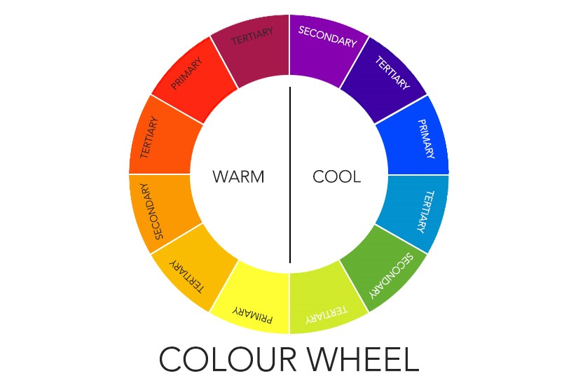
To understand the colour wheel, we must know a few basic terms:
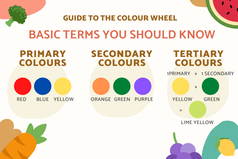
Primary Colours: Red, blue, yellow. Secondary Colours: Orange, green, purple. Tertiary Colours: 1 Primary + 1 Secondary Colour (E.g. Green + Yellow = Lime yellow).
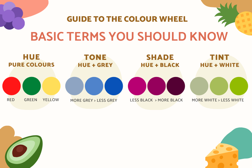
Hue: Pure colours (E.g., Red, green, yellow). Tone: Adds black to the hue to vary brightness. Shade: Adds grey to the hue to vary dullness. Tint: Adds white to the hue to vary lightness (where pastel colours originates)
Let’s see how the colour wheel can guide us towards designing beautiful and colourful spaces!
1. Complementary Colours
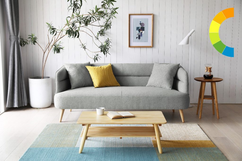
Pair complementary colours by using a series of colours placed next to each other on the wheel. It is particularly helpful if you want to brighten up a room set in dark tones!
For example, one can pair yellow and green together, perhaps even using blue tones to complement it.
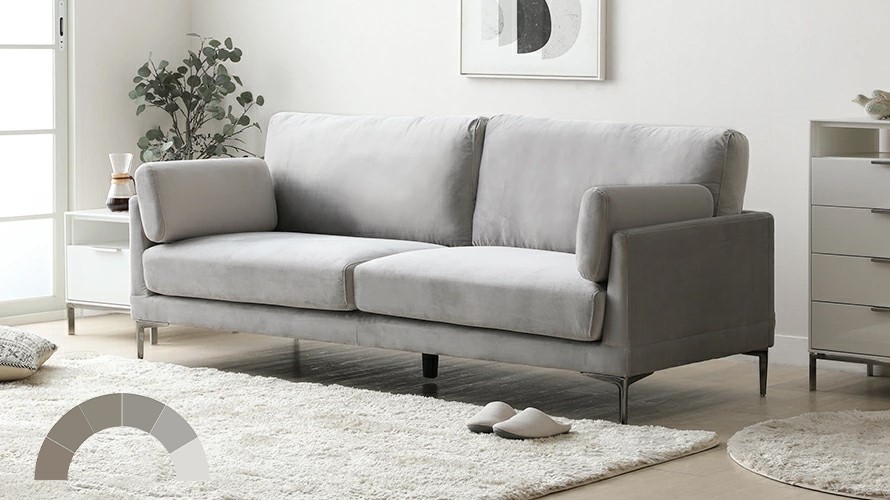
2. Monochrome
Matching monochromatic furniture is not limited to classic black and white. For a monochromatic look, create your dream interior with different shades and tints belonging to the same colour family.
As an example, to create more depth to an all-white living room, one can pair various shades of white and grey together. Colours such as off-white, ivory and stone grey together. As such, the room has more dimension while exuding a calm vibe to the tranquil space.
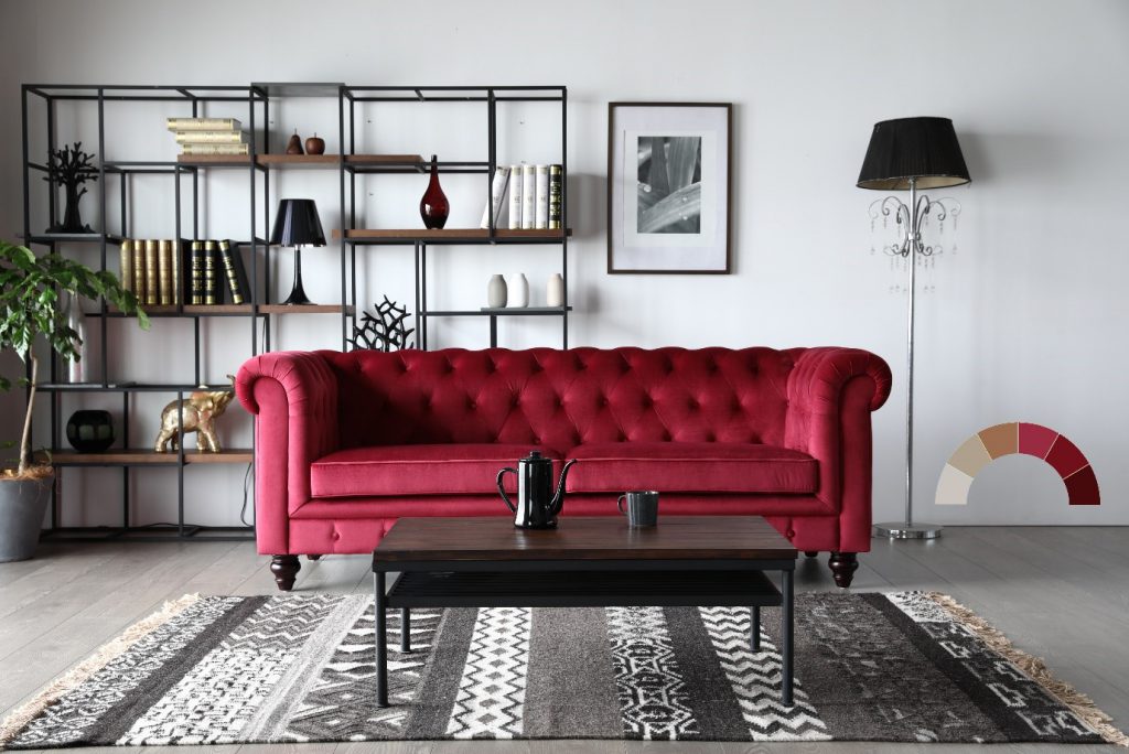
3. A mix of both styles – Making it Harmonious
If you are feeling bold and adventurous, you can choose one main colour for your room and use complementing or contrasting colours (opposite colours on the wheel) to furnish it.
For example, a mid-century, red velvet sofa against a modern, cool grey backdrop. Albeit it shows stark contrast, the room livens up with a warm glow and the sofa illuminates in its deserving spotlight.
If you are a budding interior designer or an enthusiast looking for colour inspiration, I hope this quick beginners’ guide on how to use the colour wheel helped you! May you be adventurous with your ‘bangle chocolate’ wheel of colours and successful with its pairings! And if you have any interest in revamping your living room, check out our 6 Home Décor Tips for A Cosy Living Room.
